
Branding / Identity
Daylight

A brand identity for a sustainable architecture practice, built around the idea of light as a design material.
The practice needed an identity that communicated both technical precision and environmental warmth — without falling into green-washed clichés.
We centered the brand on "daylight" — the natural force that shapes their work. The identity system uses light gradients and architectural proportions.
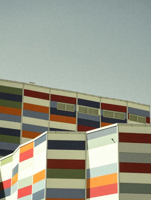
The visual language combines precise line work with warm, light-filled photography. The color palette shifts from cool to warm, mimicking the path of the sun.
Complete identity system with guidelines
Custom typography and color system
Applied across print and digital touchpoints
Want results
like this?
Let's talk about your project and how we can help you get there.